Card Accordion
Component: <pcp-card-accordion>
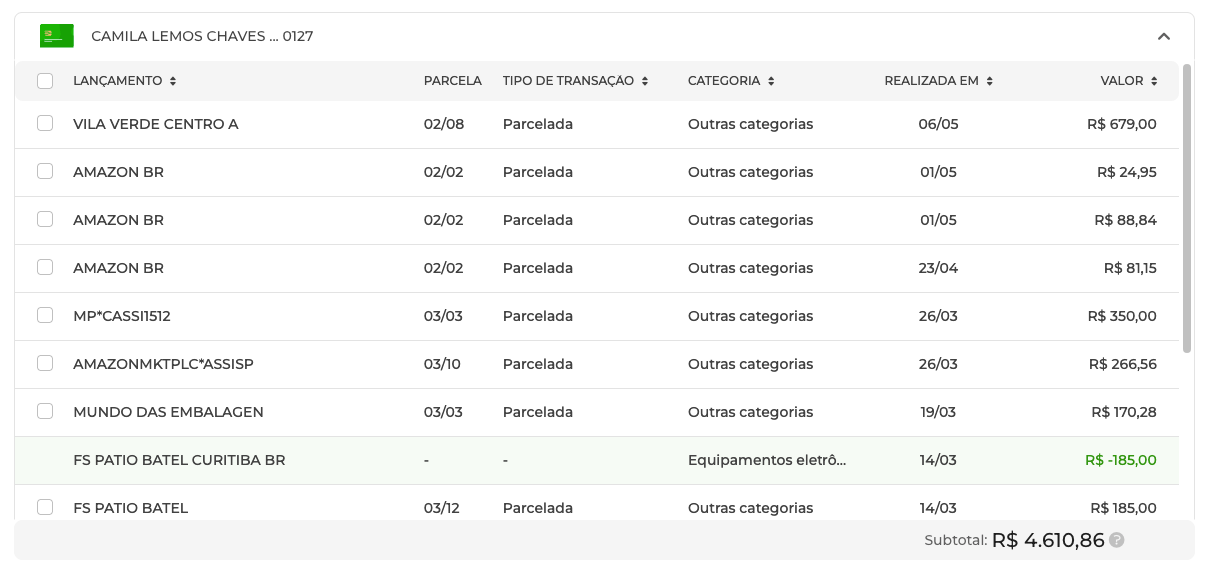
Preview:
Description
This component displays a list of credit card transactions in an accordion format, allowing users to expand and view details for each card. It also provides functionality to select rows and emit the selected values.
Usage
import { PcpCardAccordionComponent } from '@celerofinancas/pcp-client-ui';
<pcp-card-accordion
    [card]="card"
    [tooltipText]="'Subtotal por cartão'"
    (selectedRowsValue)="selectedRowsValue.emit($event)"
/>
Component Inputs and Outputs
Inputs
| Name | Type | Default | Description | Required |
|---|---|---|---|---|
card | Card | undefined | Card data to display | YES |
tooltipText | string | 'Subtotal por cartão' | Tooltip text for the card | NO |
Outputs
| Name | Type | Description |
|---|---|---|
selectedRowsValue | EventEmitter<any> | Emits the selected rows value |
Dependencies
- @celerofinancas/class-utils
- @celerofinancas/ui-common
- @celerofinancas/ui-directives
- @celerofinancas/ui-loaders
- @celerofinancas/ui-modals
- @celerofinancas/design-system